Songer Consulting
This page displays some of the logo created for a variety of organizations using Adobe Illustrator. The development of a logo involves getting to know the culture and mission of the organization as well as the ideas leaders of the entity may have in mind. Contact me to have some custom work done for your company or organization. Work doesn't stop with just a logo. It also involves the development of other graphics that signify the identity of the organization to help build the concept of “brand” whether it involves designs for embroidery on clothing or scalable graphics for marketing purposes.
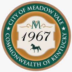 - -
- - This graphics serve as the Official Seals for the small cities located in the eastern portion of Jefferson County, Kentucky. Represented on the Meadow Vale seal is the year of incorporation for the city, the city's logo (the MV with fleur-de-lis and graphic accents), and a walking horse. The logo, also conceived by Songer, will adorn the street signs and is carried on other print and web-based elements to create a feeling of "brand" for the small community. Go here to view the implementation of the graphic elements.
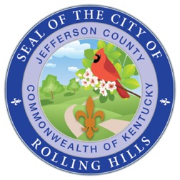
The illustration above is yet another Official Seal for another small city in Kentucky. This seal includes elements common to this part of Kentucky. The Eastern Cardinal is the state bird and features prominently over the landscape of a winding path and rolling hills. The fleur-de-lis, representative of the historical significance of the French, is also prominently displayed. There is no question as to the location of the small city.
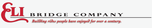
Eli Bridge Company may have begun life building bridges more than 110 years ago, but they have continued to exist by making rides millions of people have enjoyed at county fairs, amusement parks, festivals, and other venues. The company, located in Jacksonville, Illinois, is the oldest manufacturer of the Ferris Wheel. This job didn't involve creating a logo for the established company. Instead, it involved rendering it in vector form, a form that can be resized without reducing resolution regardless of it’s placement in promotional materials or whatever. Every letter in the company's name was hand drawn and adjusted to look like the original, which was scanned from old artwork that had since been misplaced.
The writers and publishers of an RV park guide needed a suitable promotional graphic. After some discussion, the image (above) was proposed and accepted. The whimsical view of a campground features a motorhome, fifth-wheel trailer, pop-up camper, and converted van.
The Family RV Association is the umbrella group for several nationwide, regional and local motorhome clubs in the US and Canada. When one of it's affiliates, Diesel RV Club, was in search of a logo they held a logo contest. As it turned out, none of the designs were felt to be totally appropriate though some ideas were presented that held interest. At this point I stepped in and offered the suggestion that was adopted by their Board of Director. With this logo as the central point of discussion, a comprehensive and illustrated guideline was presented with the Board also enacted to serve as their identity guide.
When new owners purchased an existing business they didn't have a logo for use in communications nor did they have a web site or internet domain with appropriate email accounts. A logo was created a logo, a domain name secured, and a website developed, that brought the company into the 21st century. During the process graphics were designed to market the company in a more professional manner.
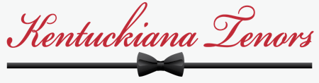
Ever heard of The Three Tenors—Spanish singers Plácido Domingo and José Carreras and the Italian singer Luciano Pavarotti? The famous three-some of operatic fame sang in concert under this banner during the 1990s and early 2000s. Their success led to other groups springing up under the same concept–performers able to do operatic and American pop music with style and gusto. Such a group has recently been formed in the Louisville area under the direction of Dr. Mozelle Clark Sherman, a long-time teacher of voice and consultant to the Kentucky Opera Association.
Rendezvous with Destiny is a church opera that premiered in Louisville during April 2012. Creating an expressive logo to be used on the opera's website, program, and promotional material was a challenge. This design, which combines display text, the sense of horizon, and variety of colors and gradients complimented the theme of the opera.
As a founding member of the Kentuckiana FileMaker Users Group, I felt we needed a expressive logo that coordinates, color wise, with FileMaker Incorporated’s corporate colors. The image show above is the logo I rendered for the group.
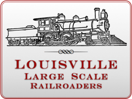
One of the things I’d like to do is build a garden railroad and start a group of local G scale hobbyists. I worked up this logo for a yet-to-exist club.